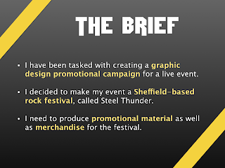
This is the presentation I gave to Nick Bax from Human Studio on November 23rd, 2016:
I thought my presentation went well. It lasted for about 8 minutes and I thought I spoke clearly, getting my ideas across well. This is the feedback I got from Nick Bax:
- He thought that the colours on the mockups weren't quite right (this is something I actually brought up during my presentation) - he said that he wasn't sure of the red colour. He pointed out that rock festivals' merchandise is classically almost all black, with only a central logo being in colour. I thought this was really useful so I am going to use a more black colour scheme for my merchandise.
- Nick also pointed out that he really liked the way I made the "steel thunder" text look on the first and last slides - maybe even more so than on my actual logos! This is because it is very simple and very striking. I might have overcomplicated my logos a little too much so this is something to consider when making my final designs. One thing he suggested I do to check if my logo works is to place it around many other festival logos on a plain background and see if it stands out. If it doesn't, then there is work to do.
- These were the key things that Nick said to me after my presentation, so to summarise, I basically should simplify the colour scheme to involve more black and make sure my logo has an impact on the viewer.
SurveyMonkey feedback:
Matthew Milan
Henry Brett
Ben Lynch
Julie Blundell
Bill Blundell


