Logo Creation
When I first started designing my logos, I browsed dafont.com for suitable fonts which I could manipulate. Please see my post "font style ideas" for the fonts which I chose and downloaded.
I then opened Illustrator and placed different fonts down together to see what they looked like. This example was with "A Love of Thunder" and "Thunder Strike".
After I had decided on a font to use for the word "steel", I decided to add style to my logo by using a different font for the letter T, and dropping it down to begin the word "thunder". To do this, I selected anchor points at the bottom of the T using the Direct Selection Tool. This allowed me to extend the bottom of the T in any direction I wanted.
This shows the finished T in the word "steel", with the rest of the word "thunder" written after it in the "Road Rage" font.
This is another design I made in a very similar way, extending the T of "steel" to begin the word "thunder". The differences are that the word "steel" isn't on a diagonal slant and the fonts used are "Lemon Milk" and "Thundercover". I think I prefer these fonts and this layout.
Here, I used the "colour" tab on the right of the screen to colour the large T in bright yellow.
Next, I began to colour the rest of the letters, using grey for the word "steel". I used the "swatches" tab on the right to get this grey colour.
I then added a thin black outline to each of the letters, using the "stroke" bar at the top of the screen, to make the logo look more striking.
This is the eyedropper tool, seen in the left-hand panel on the screen. I used it to select the yellow colour of the large T, and then colour some of the rest of the word "thunder" in the same colour.
This shows the word "thunder", completed in this design in a combination of yellow and black.
I used the Add Anchor Point Tool, seen here in the left-hand panel once again, to add the finishing touches to the word "steel". I created a new anchor point at the centre of some of the edges of the Es and Ls, and dragged it inwards using the Direct Selection Tool. This added small indents to the edges I had added anchor points to, giving some more flair to the text.
This shows the result of the above procedure.
I then added a similar colour scheme to the other design I began earlier.
I once again used anchor points to make the letters in the word "steel" look unique.
This shows a close up of some of those letters with a styled kind of underline beneath them. I am undecided on whether I will keep this.
After continuing to experiment in Adobe Illustrator, I decided on this for my final logo design.
Poster Creation
This was my mockup poster design, which needed improving (see "LO3: Presentation to Nick Bax and Feedback") in a few ways.
First of all, I used the Line Segment Tool in Adobe Illustrator to design my own lightning bolt. The one I used for my mockup was from Google Images, so it was not original, and its edges were jagged.
I then imported this lightning bolt into Photoshop, and used the Colour Overlay option to make it yellow-coloured.
This yellow-coloured bolt then became the centrepiece of my poster, after having a stroke added and being stretched to fit into the corners. At this point, I also used the Colour Overlay option to change the previously red segments to black, before using the Type Tool to change the font of the festival dates. You can also see that the logo has changed to its final version.
Here, I used the Type Tool to add a large "2017" to the centre of the lightning bolt.
To add interest to the poster, I used the Gradient Overlay option to add a slight black-to-grey colouring in the top right.
I did the same in the bottom left, so the gradient colouring happens at the ends of the lightning bolt.
This is what the poster looked like after these changes.
Next, I used the Type Tool again to add information about the ticket prices. As you can see on the left of the screenshot, their colouring comes from colour overlay and stroke effects.
I also used the Type Tool to add to the poster the names of the biggest bands playing at the festival, and gave them a colour overlay and stroke.
I then copied a guitar from my cap design (screenshots on that will be further down in this post)...
... and placed it at the top of the poster, next to the festival logo, to fill some white space.
This is the final poster design.
T-shirt Creation
This was my mockup T-shirt design, which had far too much red on it. The bright red colour all over the shirt doesn't suit the rock genre or go with my house style, so I needed to change it.
Nick Bax recommended that I go for a classic rock 'n' roll T-shirt design, meaning lots of black with a large festival logo on the front. Therefore, I got a new T-shirt template and started over with this simplistic, hard-hitting design.
I used the Pen Tool in Photoshop to select the bands at the end of sleeves...
...and coloured them yellow with the Colour Overlay option, to make the shirt more visually appealing and vibrant while still keeping it simple and classic.
This was the front of the shirt with a new version of the logo added (all-yellow "Thunder" rather than black and yellow, which was making the text difficult to read).
With the front of the shirt complete, I started working on the back, which I wanted to show band names, the festival location, the year and house style elements. This was some text I added to the back of the shirt using the Type Tool (see screenshot below).
As I experimented with different looks, I added a large "Sheffield" at the top of the back of the shirt using the Type Tool once again. I gave this a grey colour overlay and white stroke, before changing the arrangement of the "Steel Thunder festival" text.
This screenshot shows the section of the toolbar which is used to adjust stroke (outline) size.
At this point, I decided to add a white outline to the grey parts of the "Steel Thunder" logo on the front of the shirt. It looked much more professional and stylish this way.
This is the new logo on the front of the shirt.
The next thing I did was add the lightning bolt that I created in Adobe Illustrator (see "poster creation" screenshots) to the back of the shirt. I gave it an outer yellow glow and put the glass windows of St. Paul's Tower in inside it. You can also see band names and the festival date in this screenshot...
...which I quickly changed to reflect the current year.
After altering the colour overlays and strokes of some of the band names, the back of my shirt was complete.
This is the completed front of the shirt...
...and this is a complete overview of front and back.
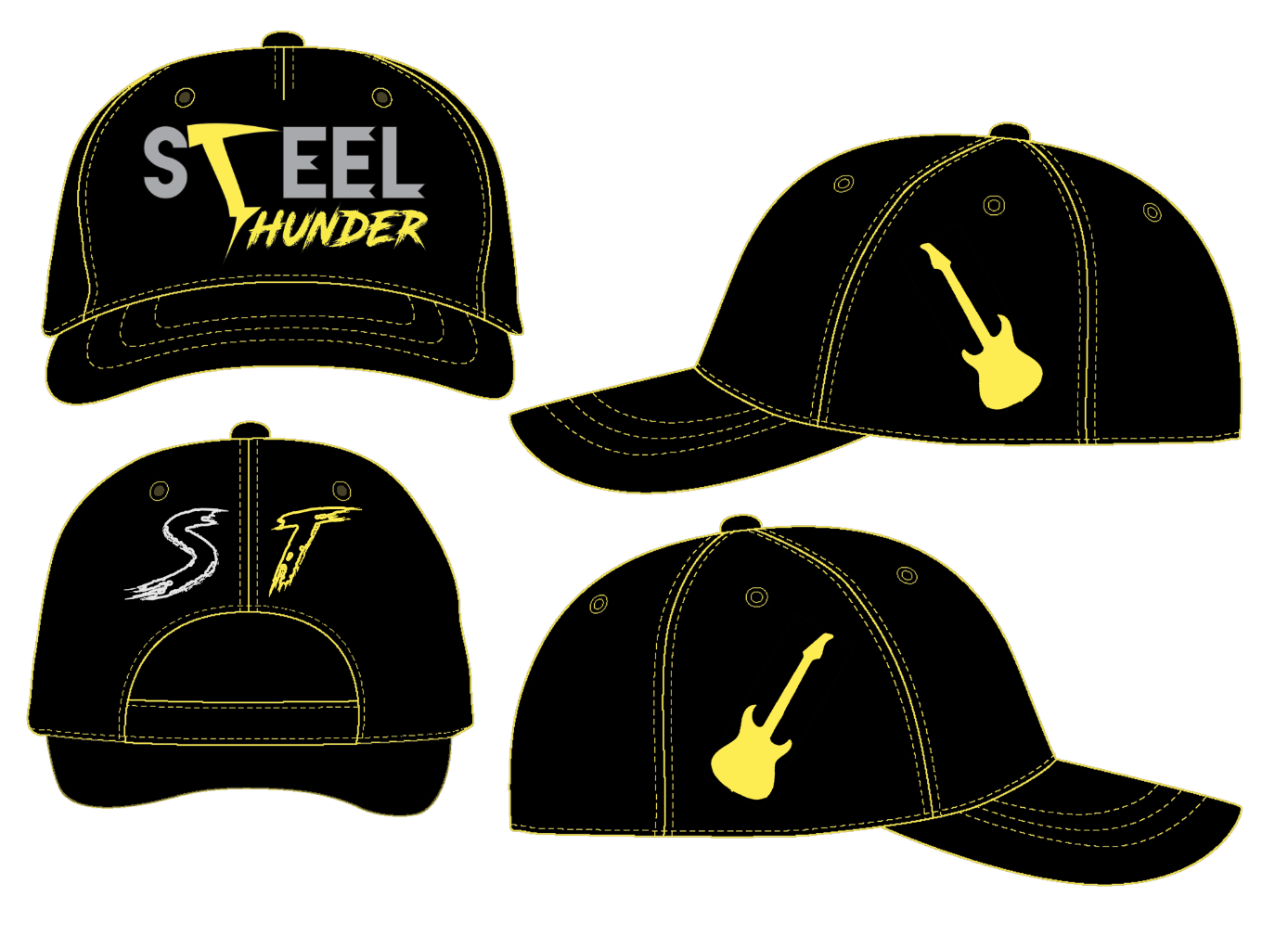
Cap Creation
For the cap, I found a blank template online and modified it for the Steel Thunder festival. The yellow trim seen in the above screenshot was originally white - I selected it using the Colour Range option in Photoshop, and changed its colour to yellow. I then added the Steel Thunder logo to the front.
I used the Type Tool to add a large S and T to the back of the cap, and coloured them in house style colours, to represent the festival name "Steel Thunder".
This shows the result.
Next, I added guitar silhouettes to the sides of the cap. You can see me using the "Layer Style" menu here to give them a yellow colour overlay.
This is my final cap design.
Mug Creation
For the mug, I once again used the lightning bolt that I designed in Adobe Illustrator using the Line Segment Tool, pictured below:
This is the completed bolt, coloured yellow using Photoshop's colour overlay option.
I then placed two of these lightning bolts on my initially blank mug template, either side of the main logo, which I placed right in the middle. This is the basic idea of my mug design.
To finalise the design, I added a monochrome photograph of Sheffield town hall behind the Steel Thunder logo in an circle. I then gave this a yellow gradient outline. The process of creating the town hall background involved...
...taking a screenshot from some filming I had done in the city centre to get my photograph (see full image below)...
...using the elliptical marquee tool to select the correct area of the town hall photo, and finally applying a layer mask to the layer in order to show only the correct section of the image on the mug. This is is a form of non-destructive editing, because no part of the original image was deleted in the process - it was just masked. I also used the colour overlay option to make the photo monochrome.
This screenshot shows how I gave the town hall section of the mug a yellow outline, with a slight gradient.
This is my final mug design.